Today we are going to create a simple login page using Bootstrap v5. Bootstrap v5 is the latest version of the Bootstrap and for creating a simple login page first of all we need to navigate to bootstrap official getting started page and grab minimum html5 template and start from there. Once we are done with the minimum page, we are going to grab a Bootstrap Card example from the official Docs and add that into the body of the previous html template.
1. Create a Simple Card
The card could be as simple as following code
<div class="card" style="width: 28rem;">
  <div class="card-body">
    <h5 class="card-title">Login</h5>
    <p class="card-text">any text you want</p>
    <a href="#" class="btn btn-primary btn-block">Login</a>
  </div>
</div>Code language: HTML, XML (xml)
2. Create a Login Form
Once you added the card the next step is to add the form into the card body for the Login page. A simple Login form may contain two input fields for taking input of email and password and one Login button. We may also need an optional anchor tag to the registration page. This form could be looking like this
<form class="form">
	<div class="form-outline mb-4">
		<input type="email" placeholder="Email Address" class="form-control form-control-lg"> </div>
	<div class="form-outline mb-4">
		<input type="password" placeholder="Password" class="form-control form-control-lg"> </div>
	<div class="form-outline mb-4 d-grid gap-2">
		<button type="submit" class="btn btn-info">Login </button>
	</div>
	<div>
		<p class="mb-2"> Don't have an account? <a class="text-white-50 fw-bold" href="#!">Sign up</a></p>
	</div>
	<hr class="my-4">
</form>Code language: HTML, XML (xml)
3. Center the Card on Screen
Now that we had created our card and Login form inside, you may notice that this card is on the left side of the screen. We need to make it center. We can change the width of the card inside the style attribute but if we do that, the card would not be much responsive. So we need some alternate way, the best way is the Bootstrap Grid system and we can use the grids to create row and columns and place the Login Card in center of that. Here is the divs you need for centering the card.
<div class="container-fluid py-5 h-100">
	<div class="row d-flex justify-content-center align-items-center h-100">
		<div class="col-12 col-md-8 col-lg-6 col-xl-5"> </div>
	</div>
</div>Code language: HTML, XML (xml)
Place your card inside these divs and it will automatically become center of the div.
Complete Code
Here is the final complete code for this login page.
<!doctype html>
<html lang="en">
<head>
<meta charset="utf-8">
<meta name="viewport" content="width=device-width, initial-scale=1">
<title>Bootstrap demo</title>
<link href="https://cdn.jsdelivr.net/npm/bootstrap@5.2.0/dist/css/bootstrap.min.css" rel="stylesheet" integrity="sha384-gH2yIJqKdNHPEq0n4Mqa/HGKIhSkIHeL5AyhkYV8i59U5AR6csBvApHHNl/vI1Bx" crossorigin="anonymous"> </head>
<body>
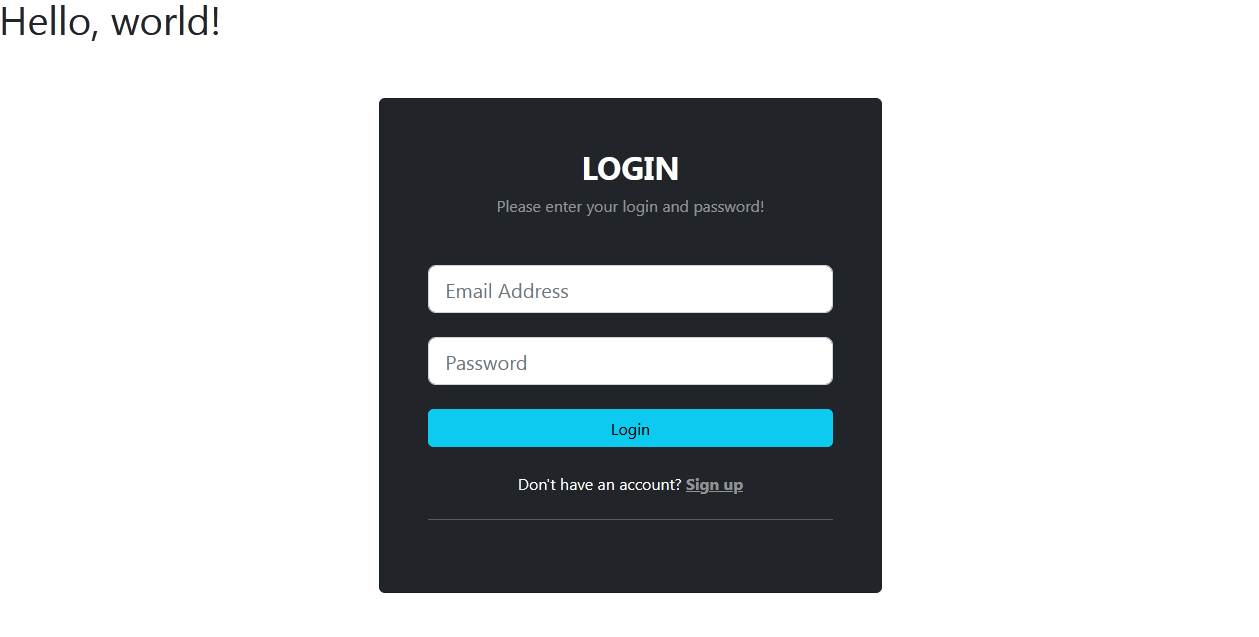
<h1>Hello, world!</h1>
<div class="container-fluid py-5 h-100">
<div class="row d-flex justify-content-center align-items-center h-100">
<div class="col-12 col-md-8 col-lg-6 col-xl-5">
<div class="card bg-dark text-white" style="">
<div class="card-body p-5 text-center">
<h2 class="fw-bold mb-2 text-uppercase">Login</h2>
<p class="text-white-50 mb-5">Please enter your login and password!</p>
<form class="form">
<div class="form-outline mb-4">
<input type="email" placeholder="Email Address" class="form-control form-control-lg"> </div>
<div class="form-outline mb-4">
<input type="password" placeholder="Password" class="form-control form-control-lg"> </div>
<div class="form-outline mb-4 d-grid gap-2">
<button type="submit" class="btn btn-info">Login </button>
</div>
<div>
<p class="mb-2"> Don't have an account? <a class="text-white-50 fw-bold" href="#!">Sign up</a></p>
</div>
<hr class="my-4"> </form>
</div>
</div>
</div>
</div>
</div>
<script src="https://cdn.jsdelivr.net/npm/bootstrap@5.2.0/dist/js/bootstrap.bundle.min.js" integrity="sha384-A3rJD856KowSb7dwlZdYEkO39Gagi7vIsF0jrRAoQmDKKtQBHUuLZ9AsSv4jD4Xa" crossorigin="anonymous"></script>
</body>
</html>Code language: HTML, XML (xml)